Let's socialize!
Welcome to our captivating world of 'All things Design & Home Furnishing'! Whether you're seeking expert design advice or love immersing yourself in beautiful spaces, this blog is your go-to destination. Stay updated on the latest trends, discover our top picks, and receive valuable design tips to style your home like a pro. We take pride in sharing insights on design concepts and materials and showcasing our handpicked favorite products that you can conveniently shop directly from our page. Join us on this exciting journey to create enchanting living spaces!
free guide
learn more
NOT SURE WHERE TO BEGIN?
SCHEDULE YOUR INSPIRATION CALL
Ready to get started?
The Best Time To Plan An Interior Design Project
Top Picks for White and Neutral Paint Colors
April 13, 2022

The paint colors that you chose can make or break a design. If you have walked into a paint store, you know that there are thousands of colors to choose from. So how do you find the color that is best for you and your design? Well, if you are looking for statement-making neutrals, look no further. These are our top picks for white and neutral paint colors that are sure to bring natural beauty to your home.
Interior and Exterior Paint Colors
Spring is in full motion and nothing refreshes a room more than paint! These soft neutral shades are sure to become the muse for your space and will create a consistent flow and color palette throughout your home. The paint colors will also work in any room, including living rooms, and bedrooms plus your home’s exterior.
In the current real estate market, trends for contemporary and modern homes lean toward darker colors for home exterior color palettes. Darker colors have been around for quite some time for exterior trim colors. By painting the entire exterior or sections of the exterior a darker color, you create a modern, bold, and beautiful design. If painting the entire exteriors is too bold of a choice for you, try painting your front doors or the shutters to give a new and modern pop to your home. One fun fact is that just painting your front door actually increases the resale value of your home by thousands of dollars.

Our Favorite White and Neutral Paint Colors
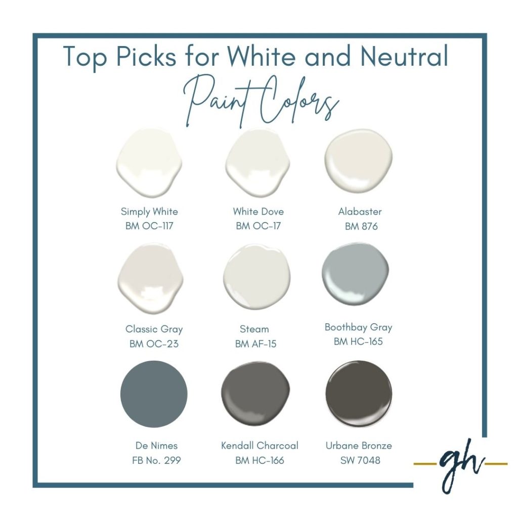
Benjamin Moore Alabaster White 876
Is a fresh, lively white paint that compliments any room or style. It has a touch of pink and is part of the Benjamin Moore Classics collection.
Benjamin Moore Simply White OC-117
As Benjamin Moore’s 2016 Color of the Year, this white is somewhere in between the bright Chantilly Lace and the warm Cloud White colors. It is clean, crisp, and can be multi-purposed for trim, ceilings, and walls. It has a warm yellow undertone that also makes it an excellent wall color. Stick with a consistent Simply White color story throughout a space or pair it with vibrant pops of colors.
Benjamin Moore White Dove OC-17
White Dove is one of those paints that look good in any space no matter the lighting. It is very soft and classic. The light tones make it a solid choice for moldings and trim.

Benjamin Moore – Steam AF-15
An appealing white paint color that offers a clean soft and fresh look. Steam pairs beautifully with Benjamin Moore Morning Dew OC-140.
Benjamin Moore – Classic Gray OC-23
A multitalented shade of gray that is so light, the color could also function as an off-white paint color. Classic Gray is a lovely balance between a light gray, with a touch of taupe. The color’s blends seem to morph to the mood and tones of almost any room. The color also pairs beautifully with Benjamin Moore’s Decorators White for trim paint.
Benjamin Moore – Boothbay Gray HC-165
This color is one of Benjamin Moore’s Historic collections of paint colors and delivers timeless color that can be used in both traditional and contemporary spaces. The color is a steely gray with hints of blue. We love to use this color for a drop zone mud room, bathroom, and laundry room cabinets. Boothbay Gray creates a soft and updated look when paired with a creamy white trim.

Sherwin Williams – Urbane Bronze 7048
Urbane bronze makes our top-picks list for both interiors and exteriors. This color contrasts beautifully with all of the soft neutrals above and is perfect for a ceiling, a focus wall, bookshelves, or even a moody den or office.
Benjamin Moore – Kendall Charcoal HC-166
This luxurious gray paint was Benjamin Moore’s trend paint in 2017. It is our go-to paint for cabinetry when you want a dark cabinet without going all the way to black. Kendall Charcoal creates the pop of a darker color with a softness that lends itself to any style.
Farrow & Ball De Nimes No. 299
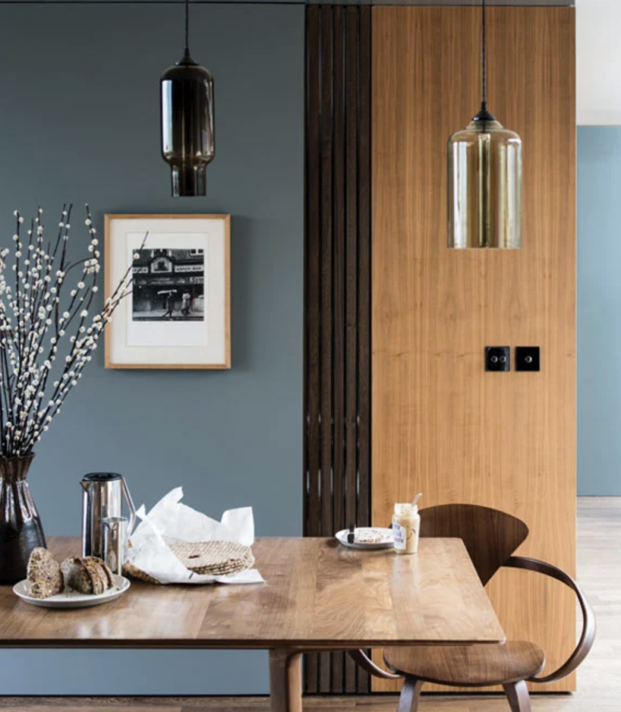
Farrow & Ball explains this paint color as “denim, it’s blue hue is ultimately fashionable and yet always feels grounded.” The grayish-blue is absolutely gorgeous on walls and is great for kitchens, bathrooms, studies, and bedrooms. One of our favorite pairings right now is Farrow & Ball’s De Mines and Railings No. 31. Use De Nimes for the walls and add cabinetry painted in Railings No. 31 for a stunning combination.

Selecting Paint
Painting brings a fun new change to your home. Given the wide range of undertones in all paint colors, choosing a hue requires some trial and error before selecting the perfect one for your project. Grays and whites are perfect colors because they can be paired with almost any color. Before you run off and buy a few gallons of paint, you need to test the colors in the area that you are painting.
Selecting the perfect color requires testing the color in different lighting and on the surface area. You wouldn’t believe the number of times that we have brought swatches into a home, and the color completely changes! The color chips from the stores are great, but order samples. Some paint stores like Benjamin Moore will paint boards for you to test out, while others have sticky boards that go up and can come down without damaging the wall.