


Color Psychology & Palette Planning: Designing with Mood & Function in Mind
Understanding the Influence of Color on Emotions
Color wields remarkable power in shaping our emotional responses, often before we consciously register its presence. In both design and daily life, hues can evoke a spectrum of feelings—calming, energizing, inspiring, or even unsettling. This psychological impact is rooted in both cultural associations and innate human reactions, making color a foundational element in crafting intentional spaces and visual experiences.
The Emotional Spectrum of Colors
Different colors are linked to specific moods and psychological effects. For example, blue is frequently associated with tranquility, trust, and clarity, making it a popular choice in environments meant to soothe or foster concentration. Warm tones such as red and orange, on the other hand, are known to stimulate energy, passion, and even appetite—ideal for dynamic spaces or areas meant to encourage socialization. Meanwhile, green, with its connections to nature, often instills a sense of balance, renewal, and calm.
- Red: Excitement, urgency, passion
- Yellow: Optimism, creativity, attention
- Blue: Serenity, reliability, focus
- Green: Harmony, growth, relaxation
- Purple: Luxury, mystery, imagination
Cultural and Personal Contexts
It’s essential to recognize that color perception can be influenced by cultural background and personal experiences. While white symbolizes purity and peace in many Western societies, it is often associated with mourning in several Eastern traditions. Designers must be mindful of their audience, leveraging color not only to enhance mood but also to ensure cultural relevance and sensitivity.
By understanding how color influences emotions, designers lay the groundwork for palette planning that aligns with both mood and function, setting the stage for more effective and meaningful design choices.
Exploring the Principles of Color Theory in Interior Design
Understanding the principles of color theory is fundamental to crafting interiors that evoke specific moods and serve distinct functions. At its core, color theory examines how colors interact, the emotional responses they elicit, and the harmonious combinations that can transform a space. In interior design, these principles serve as a roadmap for selecting palettes that not only reflect personal taste but also optimize the atmosphere and usability of a room.
The Color Wheel and Harmonies
The traditional color wheel is a foundational tool, organizing hues into primary, secondary, and tertiary categories. By leveraging this visual guide, designers can identify harmonious color relationships—such as complementary, analogous, and triadic schemes—that enhance visual appeal and balance within a space. For instance, a complementary palette featuring blue and orange creates a lively contrast, perfect for energizing communal areas, while analogous schemes using adjacent colors like green, blue, and teal foster tranquility in bedrooms or relaxation zones.
Color Temperature and Emotional Impact
Color temperature—whether a hue is warm or cool—significantly influences the perceived mood of a room. Warm colors like reds, yellows, and oranges tend to invigorate and stimulate, making them ideal for social spaces such as living rooms and kitchens. In contrast, cool tones such as blues, greens, and purples promote calm and concentration, suiting offices, bathrooms, and restful retreats.
By mastering the principles of color theory, interior designers can strategically curate palettes that not only please the eye but also support the intended function and emotional ambiance of every room. This thoughtful approach sets the stage for deeper exploration into the psychological effects and practical applications of color in design.
Selecting a Harmonious Palette for Gracious Home Interiors
Creating a gracious home interior begins with the artful selection of a harmonious color palette. The colors you choose serve as more than mere decoration—they establish mood, influence perception, and shape the very personality of each room. Achieving harmony in your color scheme is both a science and an intuitive process, grounded in color psychology and practical design principles.
Understanding the Foundation of Color Harmony
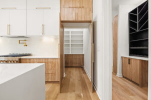
At its core, a harmonious palette relies on balance, unity, and subtle contrast. Start by considering the architectural features and natural light within your space. Soft, neutral tones such as warm beiges, cool greys, or gentle off-whites create a serene backdrop, providing flexibility for accent colors and artwork. These foundational hues are ideal for gracious interiors, radiating tranquility and sophistication while allowing personal touches to shine.
Integrating Color Psychology
Color psychology plays a pivotal role in palette planning. Blues and greens promote calm and relaxation—perfect for bedrooms and living areas—while yellows and soft oranges bring warmth and energy to kitchens and dining spaces. Consider the intended function of each room and the emotional response you wish to evoke. For example, a study adorned with muted greens may foster focus, whereas a sunlit foyer in buttery yellow offers a welcoming embrace.
Creating Cohesion with Accents and Layers
To maintain a harmonious flow throughout your home, select two or three accent colors that subtly repeat across rooms. Incorporate these hues through textiles, artwork, and accessories, ensuring each space feels distinct yet connected. Layering textures and patterns within your chosen palette adds depth, preventing monotony and infusing your interiors with gracious elegance.
Ultimately, a thoughtfully curated color palette enhances both the beauty and livability of your home, setting the stage for gracious, inviting interiors that reflect your unique style.
Designing Spaces for Calm and Relaxation with Color
Creating an environment that fosters tranquility and relaxation begins with thoughtful color selection. The psychology of color reveals that certain hues have an innate ability to soothe the mind, reduce stress, and promote a sense of well-being. When designing spaces intended for calm—such as bedrooms, reading nooks, or meditation areas—it is essential to understand how color choices can influence mood and function.
The Calming Spectrum: Soft Blues, Greens, and Neutrals
Soft blues evoke a sense of serenity and clarity, reminiscent of peaceful skies and gentle waters. These shades are ideal for spaces where relaxation is paramount, as they help slow the pulse and reduce anxiety. Similarly, gentle greens—especially those inspired by nature—bring a restorative quality, symbolizing renewal and balance. Neutrals such as warm grays, creamy whites, and subtle taupes serve as a grounding backdrop, allowing the mind to rest and making the space feel open and uncluttered.
Layering and Accents for Enhanced Comfort
While primary wall colors set the overall mood, layering different tones and adding soft accent colors can deepen the sense of calm. Incorporating muted pastels or natural wood elements through furniture and accessories prevents the space from feeling sterile, instead cultivating warmth and coziness. Textures, such as plush rugs or linen draperies, further reinforce a peaceful atmosphere.
Ultimately, designing with color for relaxation is about balance. By carefully blending soothing hues and tactile elements, spaces become sanctuaries where peace and rejuvenation flourish, setting the tone for every other design decision that follows.
Incorporating Energizing Hues for Dynamic Living Areas
In the heart of every home, living areas serve as dynamic spaces for relaxation, entertainment, and interaction. Choosing colors that invigorate these rooms is essential not just for aesthetics but for shaping the overall mood and functionality. Understanding the principles of color psychology can help you deliberately select hues that foster vitality, stimulate conversation, and create an inviting atmosphere.
The Power of Warm and Vibrant Shades
Energizing hues—such as vivid reds, sunny yellows, and lively oranges—have a profound impact on the ambiance of shared spaces. These colors are known to evoke warmth and excitement, making them ideal for areas where people gather and engage. Red, for example, is associated with passion and energy, encouraging social interaction and lively discussions. Yellow, reminiscent of sunlight, brings cheerfulness and a sense of optimism, while orange bridges the two, offering both enthusiasm and warmth. Integrating these shades can be as simple as painting an accent wall, choosing bold textiles, or incorporating statement art pieces.
Balancing Intensity with Neutrals
While energizing colors can transform a living area into a hub of activity, balance is key. Pair these hues with neutral tones—such as soft grays, creamy whites, or earthy taupes—to prevent the space from feeling overwhelming. Neutrals ground the vibrant palette, offering visual rest and enhancing the overall cohesion of the room.
By thoughtfully weaving energizing hues into your living areas, you create environments that spark vitality and inspire connection. This mindful approach to color palette planning ensures your dynamic spaces are as functional as they are emotionally uplifting.
Balancing Mood and Function Through Strategic Color Choices
Color is far more than a superficial design element—it is a powerful tool that shapes both the emotional atmosphere and the practicality of a space. The art of balancing mood and function through thoughtful color selection lies at the heart of effective palette planning, ensuring that every environment not only looks appealing but also supports its intended use. Understanding the nuances of color psychology enables designers to craft spaces that evoke specific feelings while enhancing usability.
The Influence of Color on Mood
Every hue carries its own psychological weight. Warm tones such as reds, oranges, and yellows tend to energize and stimulate, making them ideal for spaces meant to spark conversation or creativity, like dining rooms or collaborative offices. In contrast, cool colors—blues, greens, and purples—exude calmness and tranquility, promoting relaxation in bedrooms, spas, or reading nooks. Neutrals, when used strategically, offer balance and versatility, serving as a canvas that allows accent colors to shine or helping ground more vibrant palettes.
Aligning Color with Function
Selecting a color palette is not solely about aesthetics; it must align with the practical requirements of the space. For example, high-traffic areas benefit from darker, more forgiving shades that mask wear, while workspaces often leverage colors proven to boost focus and productivity, such as soft greens or muted blues. Retail environments strategically use color to direct attention and influence purchasing behavior, while healthcare settings rely on gentle hues to reduce anxiety.
By thoughtfully balancing mood and function through strategic color choices, designers can create environments that are both emotionally resonant and highly effective, setting the stage for spaces that truly support those who inhabit them.
Curating a Cohesive Flow of Color Throughout the Home
Curating a harmonious color palette isn’t merely about choosing favorite shades—it’s about orchestrating an intentional journey through each space, shaping both mood and function. The art of cohesive color flow ensures that every room feels connected, creating visual continuity while allowing for distinct atmospheres that reflect the purpose of each area. This approach transforms homes into unified environments where transitions feel effortless rather than jarring.
Understanding the Foundation of Color Cohesion
Begin by establishing a foundational palette—three to five central hues that will anchor your home’s aesthetic. This core selection might include a dominant color, a secondary shade, and complementary accents. By repeating these tones in varying intensities or finishes, you lay the groundwork for seamless transitions between rooms. Consider the architectural features and natural light in each space, as these elements influence how colors are perceived and interact with one another.
Techniques for Seamless Transitions
- Gradual Shifts: Opt for subtle shifts in shade or temperature when moving between adjacent rooms. For example, transition from a soft sage in the living area to a muted olive in the dining room, creating a gentle progression that soothes the senses.
- Recurring Accents: Incorporate recurring accent colors in textiles, artwork, or trim to reinforce unity without monotony.
- Purposeful Contrasts: Reserve bolder contrasts for spaces where you want to evoke energy or delineate function, such as a vibrant kitchen or a tranquil bedroom retreat.
Ultimately, cohesive color planning is about balance—honoring personal style while respecting the natural rhythm of the home. With mindful palette choices, each room feels like a thoughtful extension of the last, guiding occupants on a visually pleasing journey that heightens comfort and clarity.
